Applied R: Intro to plotting w/ ggplot2
Joanna Schroeder
2023-06-01
Note: If chunks do not run, you may have to uncomment package installation or other lines
Setup
# Load Libraries
#install.packages("tidyverse")
library(tidyverse)

# Download Datasets
metadata <- read_csv("metadata.csv")
# airquality dataset
Heads up!
- We will have a coding best-practices lecture next week
- We will have a mapping visualization session next week
- We will have a data visualization best-practices lecture later in the summer
Things to know
- Three ways of R
- Today we will be using tidy syntax
- Plotting in Rivanna
- Rivanna’s RStudio version is out of date, so plots to not show up in the plot pane
- I’d recommend plotting in an RMarkdown on Rivanna
ggplot2lingo- “Grammar of Graphics”
- ggplots are built of layers
- In tidy syntax, we use
%>%; in ggplot we use+to add layers aes()= “aesthetics”; this is how we map variables/other aestheticsgeom_= “geometry”; these are built-in types of mapping for plots (e.g.geom_bar()= bar chart,geom_hist= histogram)
- Generally, it is much easier to work with long data in
ggplot2than widedplyr::pivot_longer()will become your best friend
There are a lot of ggplot2 resources online
Let’s start plotting!
Make a scatter plot
# View the dataset to understand its structure (wide or long?), variables, data types
view(airquality)

library(ggpmisc)
## Warning: package 'ggpmisc' was built under R version 4.1.2## Loading required package: ggpp## Warning: package 'ggpp' was built under R version 4.1.2##
## Attaching package: 'ggpp'## The following object is masked from 'package:ggplot2':
##
## annotate# Pipe the dataset into a ggplot() call
airquality %>%
# Set aesthetic mappings to the x and y axes for all geoms
ggplot(aes(x = Wind, y = Temp)) +
# Create a point layer
# geom_point() #+
# Change the aesthetic mappings of just the point layer
geom_point(aes(color = as.factor(Month))) +
# Add a trendline, alter the method used to create it
# geom_smooth() #+
geom_smooth(method = lm) +
# Add statistical information about the trendline, position it in the plot
stat_poly_eq(use_label(c("R2", "p", "n")),
label.x = 20,
label.y = 90)## `geom_smooth()` using formula = 'y ~ x'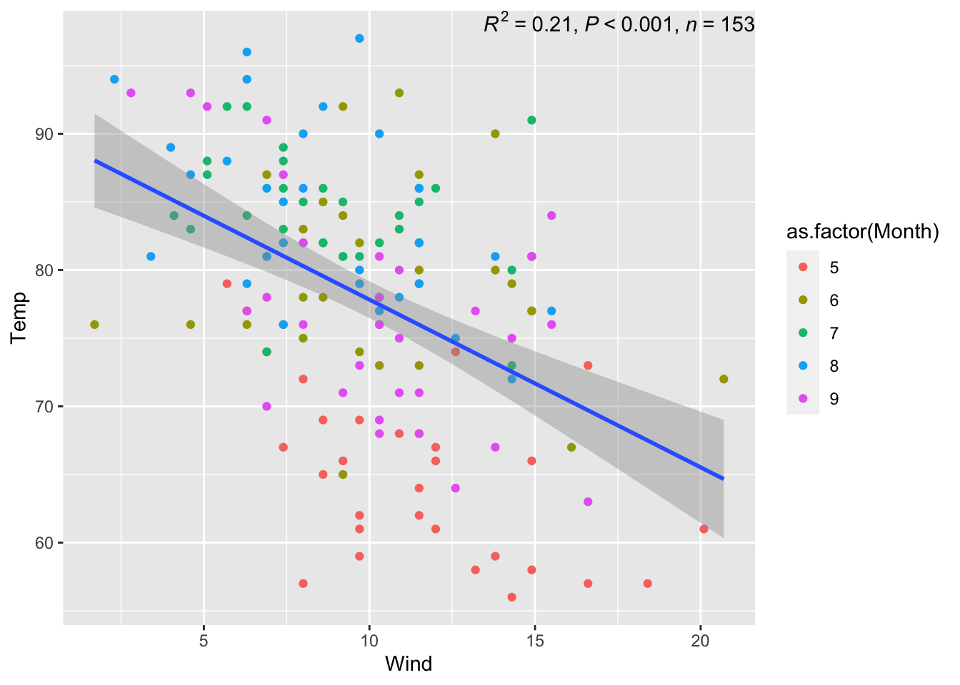
Make a line graph
# Manipulate the data before piping it into the ggplot() call
airquality %>% filter(Month == 5) %>%
# Set aesthetic mappings to the x and y axes for all geoms
  ggplot(aes(x = Day, y = Temp)) +
# Create a line layer
  geom_line()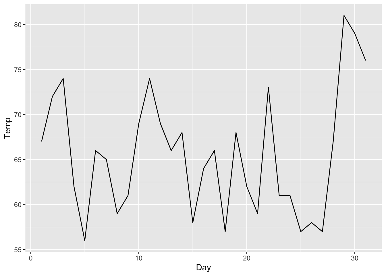
#library(lubridate)
# Manipulate the data before piping it into the ggplot() call to create a new date column
#airquality %>% mutate(date = make_date(2000, Month, Day)) %>%
#  ggplot(aes(x = date, y = Temp)) +
#  geom_line()

library(lubridate)
# Manipulate the data before piping it into the ggplot() call to create a new date column
airquality %>% mutate(date = make_date(2000, Month, Day)) %>% select(-Month, -Day) %>%
# Pivot the data longer so we can plot all variables at once
  pivot_longer(cols = c("Ozone", "Solar.R", "Wind", "Temp")) %>%
  ggplot(aes(x = date, y = value)) +
  geom_line() +
# Plot all the variables on the same plot as rows
  facet_grid(name ~ .)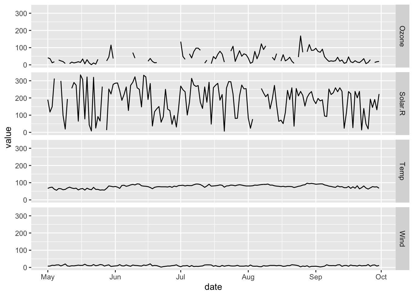
Make a bar graph
# View the dataset to understand its structure (wide or long?), variables, data types
view(metadata)
# Pipe the dataset into a ggplot() call
metadata %>%
# Set aesthetic mapping for just one variable
  ggplot(aes(x = element)) +
# Create a histogram layer and set a statistical transformation for it
  geom_histogram(stat = "count") +
# Change the angle of axis labels
   theme(axis.text.x = element_text(angle = 60, vjust = 1, hjust=1)) +
# Change the color of geoms
   geom_histogram(aes(fill = collection), stat = "count")
## Warning in geom_histogram(stat = "count"): Ignoring unknown parameters:
## `binwidth`, `bins`, and `pad`## Warning in geom_histogram(aes(fill = collection), stat = "count"): Ignoring
## unknown parameters: `binwidth`, `bins`, and `pad`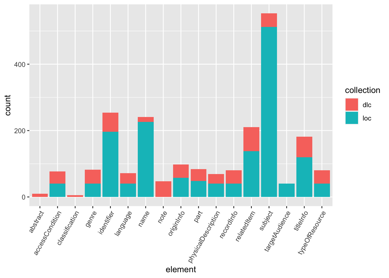
# Flip x and y axis
 coord_flip()
## <ggproto object: Class CoordFlip, CoordCartesian, Coord, gg>
## aspect: function
## backtransform_range: function
## clip: on
## default: FALSE
## distance: function
## expand: TRUE
## is_free: function
## is_linear: function
## labels: function
## limits: list
## modify_scales: function
## range: function
## render_axis_h: function
## render_axis_v: function
## render_bg: function
## render_fg: function
## setup_data: function
## setup_layout: function
## setup_panel_guides: function
## setup_panel_params: function
## setup_params: function
## train_panel_guides: function
## transform: function
## super: <ggproto object: Class CoordFlip, CoordCartesian, Coord, gg>Bare-minimum visualization
The plots we’ve just created are what I would consider “bare-minimum” visualizations. Here’s how we take them to the next level:
- Think about our data story. What do we want to say about our data? Which plot type, color scheme, annotations, etc. are best suited to tell this story? Who is our audience?
- Choose an accessible color palette. Read more on accessible colors here
- Pay attention to default text sizes. The default
ggplot2text sizes are generally too small. Increasing the text size is an easy way to make more accessible, professional looking plots. Read more on accessible text here - Consider your figure as standing alone. The best figures are not just a plot, but a plot with a descriptive title, caption, and labels. Empathize with your audience to consider what information they would need to interpret your figure without you there. Always include information about the data source(s) in the caption. Do not leave variable names unaltered.
Next level visualization
# Create a custom color palette
my_pal <- RColorBrewer::brewer.pal(11, "PRGn")[c(2, 9)]

library(ggtext)
## Warning: package 'ggtext' was built under R version 4.1.2library(RColorBrewer)
# Manipulate data before piping it into the ggplot() call
metadata %>% group_by(element, collection) %>% mutate(count = n()) %>% distinct(element, count, collection) %>%
# Set aesthetic mapping for all layers
# Reorder a variable by its value
ggplot(aes(x = reorder(element, count), y = count, fill = collection)) +
# Create a column layer, set the columns to equal width
geom_col(position = position_dodge(preserve = "single")) +
# Flip the axes
coord_flip() +
# Add a default theme before theme alterations
theme_minimal() +
# Alter the legend position
theme(legend.position = "bottom",
# Alter the text size
text = element_text(size = 20)) +
# Add annotations, specify their position and color
annotate("text", y = 440, x = 16.25, label = "In the Elections Web Archive, subject repeats a mean \n average of 12.8 times per metadata record", color = my_pal[2]) +
annotate("text", y = 120, x = 1.8, label = "The Digital Library of the Caribbean metadata contains three \n unique top-level elements: note, abstract, and classification" , color = my_pal[1]) +
# Modify the titles, axes labels, and caption
labs(title = "Frequency of Top-Level Elements",
# subtitle = "Frequency of Top-Level Elements",
y = "Number of Observations",
x = "Top-Level Element",
caption = "Based on 40 random records collected from each repository (80 records total). \n
Data Sources: https://www.dloc.com/ and \n
https://www.loc.gov/collections/united-states-elections-web-archive/") +
# Add a custom color palette, alter the names for the legend and variables
scale_fill_manual(values = my_pal, name = "Collection",
labels=c("Digital Library of the Caribbean", "Elections Web Archive"))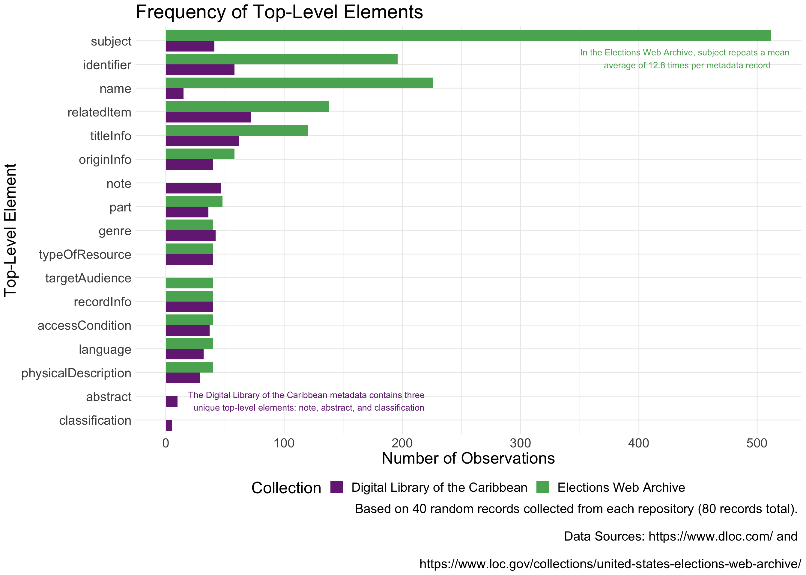
# Save our plot
getwd()
## [1] "/Users/joannaschroeder/Documents/R/intro-rmd-websites/web"ggsave("metadata_exploration-element_comparison_bar.png", plot = last_plot(),
height = 10, width = 14, units = "in", bg = "white")Mapping with ggplot
library(tidyverse)
library(tidycensus)

# First use tidycensus to get the data
vars <- c("S1702_C01_001", "S1702_C02_001", "S1702_C01_043E", "S1702_C01_044E", "S1702_C01_045E", "S1702_C01_046E", "S1702_C01_047E", "S1702_C01_048E", "S1702_C01_049E", "S1702_C01_050E")
fairfax_family_poverty <- get_acs(geography = "tract", variables = vars, state = "VA",
                                  county = "Fairfax County", year = 2020, geometry =
                                    TRUE, survey = "acs5", cache_table = TRUE)
# Make sure you have the argument geometry = TRUE

library(tidyverse)
library(tidycensus)

# Second use ggplot to map the data
fairfax_family_poverty %>% filter(variable == "S1702_C01_001") %>%
  # If more than one variable, filter for the name of the variable you want to map
  ggplot() +
  geom_sf(aes(fill = estimate)) + # fill = name of column with values to map
  labs(fill = "Population (Count)", # Legend title
       title = "Fairfax County Population (2020)", # Graph title
       subtitle = "Measured at the Census Tract",
       caption = "A great phrase explaining my figure \n
       Data Source: American Community Survey, 5-Year Estimates, Table S1702") +
        #Graph caption
  theme_void() # Takes out x and y axis, axis labels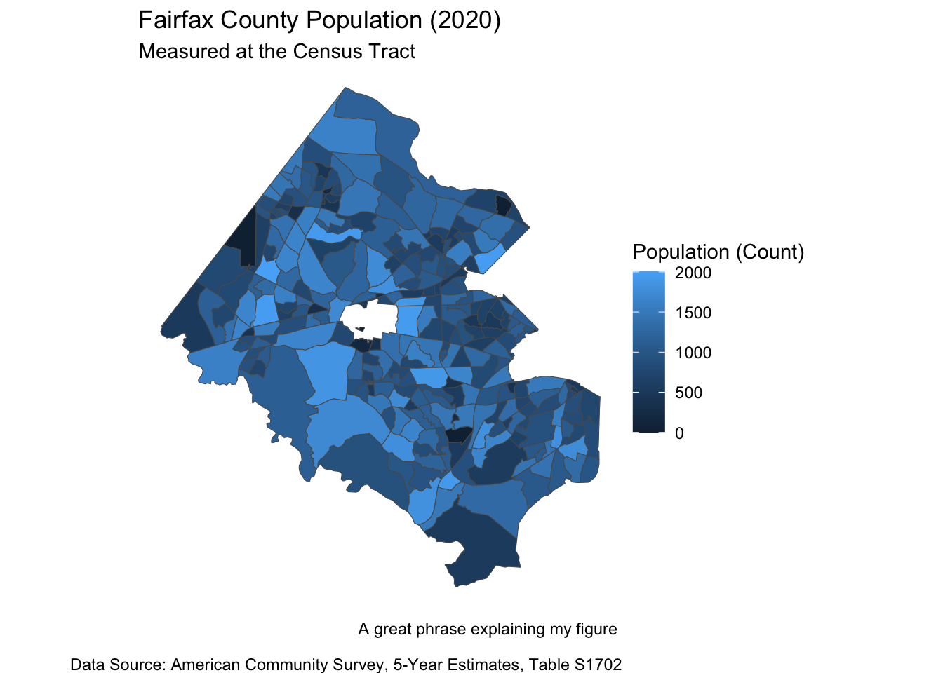
# You can also make whatever changes you want to the map (color palettes, geography outlines, adding points etc)


library(viridis)
fairfax_family_poverty %>% filter(variable == "S1702_C01_001") %>%
  # If more than one variable, filter for the name of the variable you want to map
  ggplot() +
  geom_sf(aes(fill = estimate)) + # fill = name of column with values to map
  labs(fill = "Population (Count)", # Legend title
       title = "Fairfax County Population (2020)", # Graph title
       subtitle = "Measured at the Census Tract",
       caption = "A great phrase explaining my figure \n
       Data Source: American Community Survey, 5-Year Estimates, Table S1702") +
  #Graph caption
  theme_void() + # Takes out x and y axis, axis labels
  scale_fill_viridis(option = "viridis") # or option = "magma"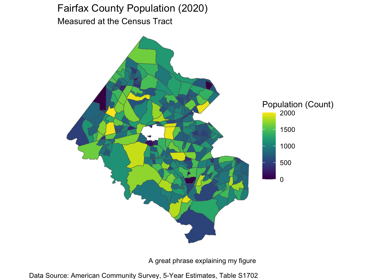
# You can also make whatever changes you want to the map (color palettes, geography outlines, adding points etc)

# These are the palettes used for the data commons
#devtools::install_github("thomasp85/scico")
library(scico)

fairfax_family_poverty %>% filter(variable == "S1702_C01_001") %>%
  # If more than one variable, filter for the name of the variable you want to map
  ggplot() +
  geom_sf(aes(fill = estimate)) + # fill = name of column with values to map
  labs(fill = "Population (Count)", # Legend title
       title = "Fairfax County Population (2020)", # Graph title
       subtitle = "Measured at the Census Tract",
       caption = "A great phrase explaining my figure \n
       Data Source: American Community Survey, 5-Year Estimates, Table S1702") +
  #Graph caption
  theme_void() + # Takes out x and y axis, axis labels
  scale_fill_scico(palette = 'lajolla')  # or palette = "vik" (divergent)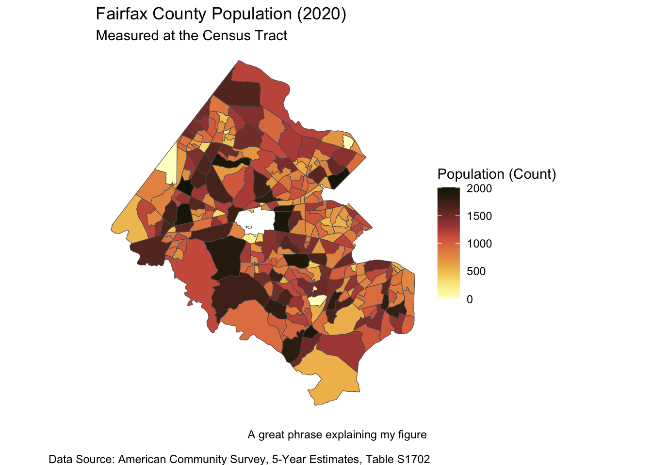
# You can also make whatever changes you want to the map (color palettes, geography outlines, adding points etc)Your turn!
# Choose one of the example datasets (or another base R dataset if you know of one)
# Use `ggplot2` to explore and visualize the data

# Create a bare-miniumum visualization or two
# If we have time, take your bare-minimum visualization to the next level

# Report out your data story