2020 Veteran Career Pathways Summer Project
Methodology
Data Cleaning and Profiling
In order to get the resumes from veterans in the DC Metropolitan Statistical Area (MSA), we first profiled the data to better understand and address the completeness, potential for duplication, and valid values of the Burning Glass Technologies resume data. In addition to filtering observations to include a reported MSA of 47900 (the code for the DC-VA-MD-WV Metropolitan Statistical Area), we also checked to see if individuals reported living in a zip code that fell in the DC MSA, and ensured that none of the entries were duplicates based on the resume’s unique ID.
To clean the education variables, we excluded individuals with no degree type variable listed. Then, we took the highest self-reported degree type variable, and used regular expressions to categorize them by the highest degree earned: certificate, some high school, high school, associate, bachelor, master, and doctorate.
Since we require an O*NET-SOC code to determine if an individual held a military job, and also require a start and end date to determine the chronological order of jobs, we permanently excluded individuals for which this information was missing. We identified individuals with military careers (veterans) based on an O*NET-SOC code beginning with 55-. This may not capture all the veterans in the data, since these jobs are very military-specific, but there was no other way to guarantee that we were only including veterans in our final sample. The most frequent 55-ONET job 55-1019.00 is “Military Officer Special and Tactical Operations Leaders”, so this sample heavily represents officers. After cleaning and filtering we were left with 7,704 veterans resumes in the DC MSA. The average year our veteran samples end their last military job is 2000, with a standard deviation of 10.
We also created duration variables calculated from the start date and end date, and excluded individuals for which the duration was negative (implying a job that had ended before it began). For multiple jobs with the same start and end year, we assumed that these jobs lasted for less than one year each and chose the higher of the two job zones to reflect the career level for that year. Not all of the remaining individuals had a listed job zone, so provided that they have a valid start and end date, we categorized these jobs as job zone 0 to distinguish them from unemployment.
Sequence Analysis
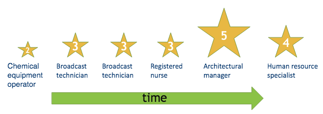
Sequence analysis refers to a method of longitudinal analysis where linear data is defined as an entire sequence. A sequence orders events and their associated states along a linear axis - in our case, time (Halpin 2016). It can be implemented with the TraMineR package in R, which enables both the analysis and visualization of sequences (Gabadinho et al. 2011). For the purposes of our sequence analysis, we define our “states” to be job zones or unemployment types and our “events” to be a transition between jobs. A table describing the different types of states that are possible is included below; these states are explained further in the Sequence Exploration section.
Sequences can be represented in several ways, as TraMineR is able to convert between them (Gabadinho et al. 2010, p. 28). However, all formats of the data require a start and end point for a state as well as the state itself. We explored both the full careers of veterans and also the 10-year period after they first exit the military. When looking at full careers we align sequences by the first date appearing on the resume. When looking at 10-year post military sequences we instead align them by the date that veterans exited the military.
Interpreting Sequence Graphs
As previously mentioned, TraMineR has several built-in functions to produce sequence visualizations. A few of the most common plots are described below to aid in interpretation of our findings.
Sequence frequency plot
A sequence frequency plot presents a view of sequence frequencies with widths of the bars proportional to the frequency. By default, the top ten most frequent states are shown.
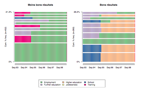
Figure 1 is a grouped sequence frequency plot. Each of these graphs depict the top ten most frequent sequences in each group. Larger barwidths correspond to greater frequency, which is the unit on the y-axis. Here, as in most sequence plots, states are represented by color and time runs along the x-axis.
State mean time plot
A state mean time plot shows the non-consecutive mean time spent in each state for a sequence object.
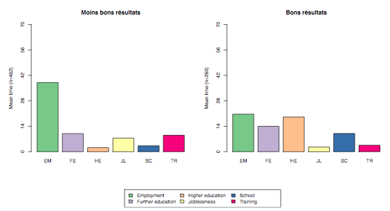
Figure 2 is a grouped state mean time plot. Again, each state is represented by color. Bar heights correspond to the mean time spent in each state, which is shown on the y-axis.
State distribution plot
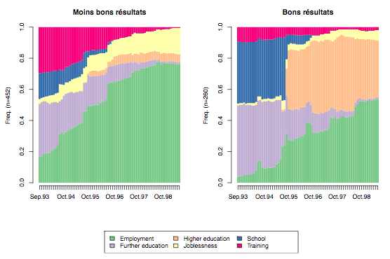
Figure 3 is a grouped state distribution plot. Here, states, again represented by colors, are shown over time, running along the x-axis. In a state distribution plot, the y-axis depicts the state frequency as a proportion of all sequences at each unit of time.
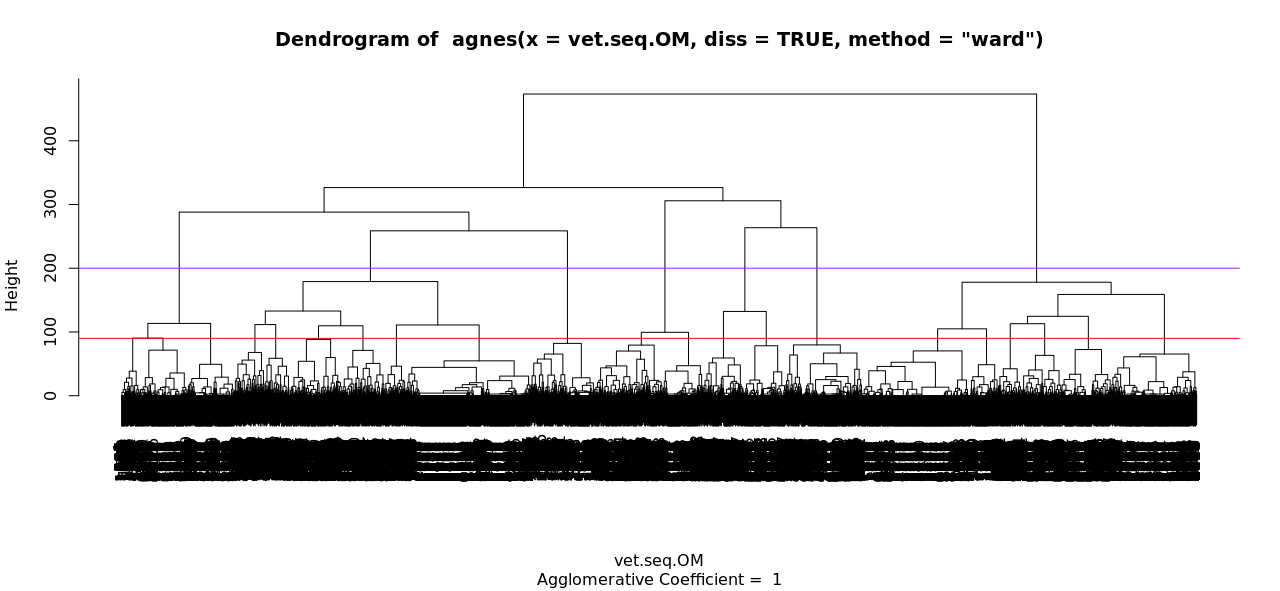
Clustering Sequences
Clustering is an unsupervised machine learning method that explores data by grouping it based on its distance from other data. Once these groups are determined, we can analyze similarities and differences between groups, and look for patterns in how the data is classified. Different methods of clustering calculate this distance differently. One such method, hierarchical clustering, does not require the number of clusters to be pre-specified, because it calculates the clusters obtained for each possible number of clusters (James et al. 2013, p. 386). These clusters can be visualized on a “dendogram”, a tree-based diagram. These diagrams provide information not just about the optimal number of clusters for gaining information about a dataset, but which clusters are closer or farther away from another.
To implement hierarachical clustering on our sequences, we used Ward’s method, which calculates the merging cost of combining two clusters. Ward’s method is easily implemented with TraMineR, which has several methods for calculating distances between sequences (Studer & Ritschard, 2016). We present some of these calculations in our Clustering results section. As hierarchical clustering does not require the number of clusters to be pre-specified, it is also necessary to determine the optimal number of clusters for analysis. We tested several numbers of clusters and determined eight clusters to be the optimal number for meaningful results and interpretations.
Tournament Theory
There are two ways of thinking about career mobility: a “path-independent” model, and a “path dependent” model. In the path-independent model, an individual’s career history can be considered independent from their current position. However, this assumption of independence may not hold in a career context, as previous job history could conceivably have a great impact on the current position an individual holds. Rosenbaum (1979) used an assumption of path dependence to develop a tournament mobility model. In this model, individuals compete for jobs in “rounds” of a tournament, and the results of each round (the “winners” and “losers”) have great influence on the chances of mobility in subsequent rounds (Rosenbaum 1979, p. 223). This model further hypothesizes that individuals have a limited number of career paths open to them, and that promotion in early rounds of the tournament improves the chances of being further promoted, attaining management levels, and reaching higher levels overall (Rosenbaum 1979, p. 226).
Given that our analysis is concerned with the career mobility of veterans, Rosenbaum’s tournament mobility model makes sense to explore further. Job zones do not make a perfect proxy for promotion and demotion in a tournament concept, since they represent the education needed for a position rather than its seniority. However, they still represent a type of mobility. Additionally, our data includes different types of unemployment: transitional unemployment (unemployment when a veteran is transitioning from a military to civilian career) and civilian unemployment (unemployment in the more traditional sense, after a civilian career has been established). We hypothesized that results in early rounds of the tournament, such as transitional unemployment or early promotion, would have different results later in the career.
To test hypotheses about path dependence in the context of promotions, demotions, and unemployment in our data, we grouped the data into variables that could indicate different promotion or unemployment styles - for example, sequences where an individual was promoted (increased in job zone) after the first period (two years). We performed chi squared tests on these variables to test for a statistical association using the MASS package (Venables and Ripley, 2002), testing five hypotheses about career mobility.
References
Gabadinho, A., G. Ritschard, M. Studer and N. S. Muller. Mining sequence data in R with the TraMineR package: A user’s guide. University of Geneva, 2010. (http://mephisto.unige.ch/traminer)
Gabadinho, A., Ritschard, G., Müller, N. S., & Studer, M. (2011). Analyzing and Visualizing State Sequences in R with TraMineR. Journal of Statistical Software, 40(4), 1-37. DOI http://dx.doi.org/10.18637/jss.v040.i04.
James, G., Witten, D., Hastie, T., & Tibshirani, R. (2013). An Introduction to Statistical Learning with Applications in R . New York, NY: Springer New York.
Rosenbaum, J. E. (1979). Tournament mobility: Career patterns in a corporation. Administrative science quarterly, 220-241.
Studer, M. & Ritschard, G. (2016). What matters in differences between life trajectories: A comparative review of sequence dissimilarity measures, Journal of the Royal Statistical Society, Series A, 179(2), 481-511. DOI http://dx.doi.org/10.1111/rssa.12125
Venables, W. N. & Ripley, B. D. (2002) Modern Applied Statistics with S. Fourth Edition. Springer, New York. ISBN 0-387-95457-0